curious jane
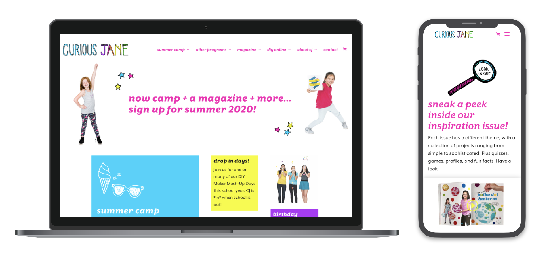
Curious Jane had outgrown their DIY Squarespace website and needed a new, customized site that could better reflect the fun, silliness and craftiness of their brand. The company had been promoting two separate entities—Curious Jane the magazine, and Curious Jane the camp. My challenge as web designer was to weave these two entities together, and create a larger, more inviting Curious Jane world.
// interaction design
// web design
// wordpress development
Site map
Our research process began with what Curious Jane wanted to accomplish with their new website, establishing their internal goals to increase sign-ups, sales, and engagement. We also asked what values, energy and tone they wanted to exhibit in their marketing. Finally, we surveyed existing magazine subscribers and camp families, asking them what they most enjoyed about working with Curious Jane.
The resulting UX design process was a balancing act: keeping clarity while embracing silliness and childlike discord; showcasing age-appropriate projects for kids within a frame that’s sophisticated enough for adult buyers; and making sure there were focused navigational pathways for camp and magazine veterans and also opportunities for open-ended exploration for new users.
Our camp finder system is a great example — we built a multi-step system for parents to find the perfect camps for their children based on their location, the dates they were available, and the topics their girls wanted to explore.
Our research led to the discovery that parents were less concerned with the topics and content of the camps, and more concerned with logistical details: whether the camps were conveniently located and what dates their daughters could attend. Therefore, we set up our system to filter out age appropriate pathways, and only present the camps available at the places and on the dates relevant to each family.
User pathways for camp finder system
Steps 1 & 2 in Camp Finder System: filtering camps by age & location
Final Step in Camp Finder System: selecting dates and specific camps to attend.
This website was strategized, created, and built alongside Amy Jacobus Marketing.


