manhattan birth
Manhattan Birth is a New York City-based birth services company, providing pregnant folks, new parents, and birth professionals the resources they need to support them through the transformative process of birthing and raising children.
The branding and website design for Manhattan Birth grew out of an extensive research process. Our research identified specific pain points and staff strain in their current web systems through data analytics and staff interviews. This research was conducted during the pandemic, where Manhattan Birth was also translating its previously in-person offerings to online settings.
We also surveyed clients and birth workers in the Manhattan Birth network to zero in on the company’s values, and what was essential to them about their web experiences.
// interaction design
// web design
// branding
A brand that embraces messy bodies, curves, & inclusivity
Manhattan Birth believes in birth as transformative processes, but one that is inseparable from the messiness of the body and its relationship. It’s fleshy, there’s blood and poop, and the process is full of disorder. Manhattan Birth is unafraid of this, and believes that clear, scientific information and community support can ground ground the beautiful mess of the body.
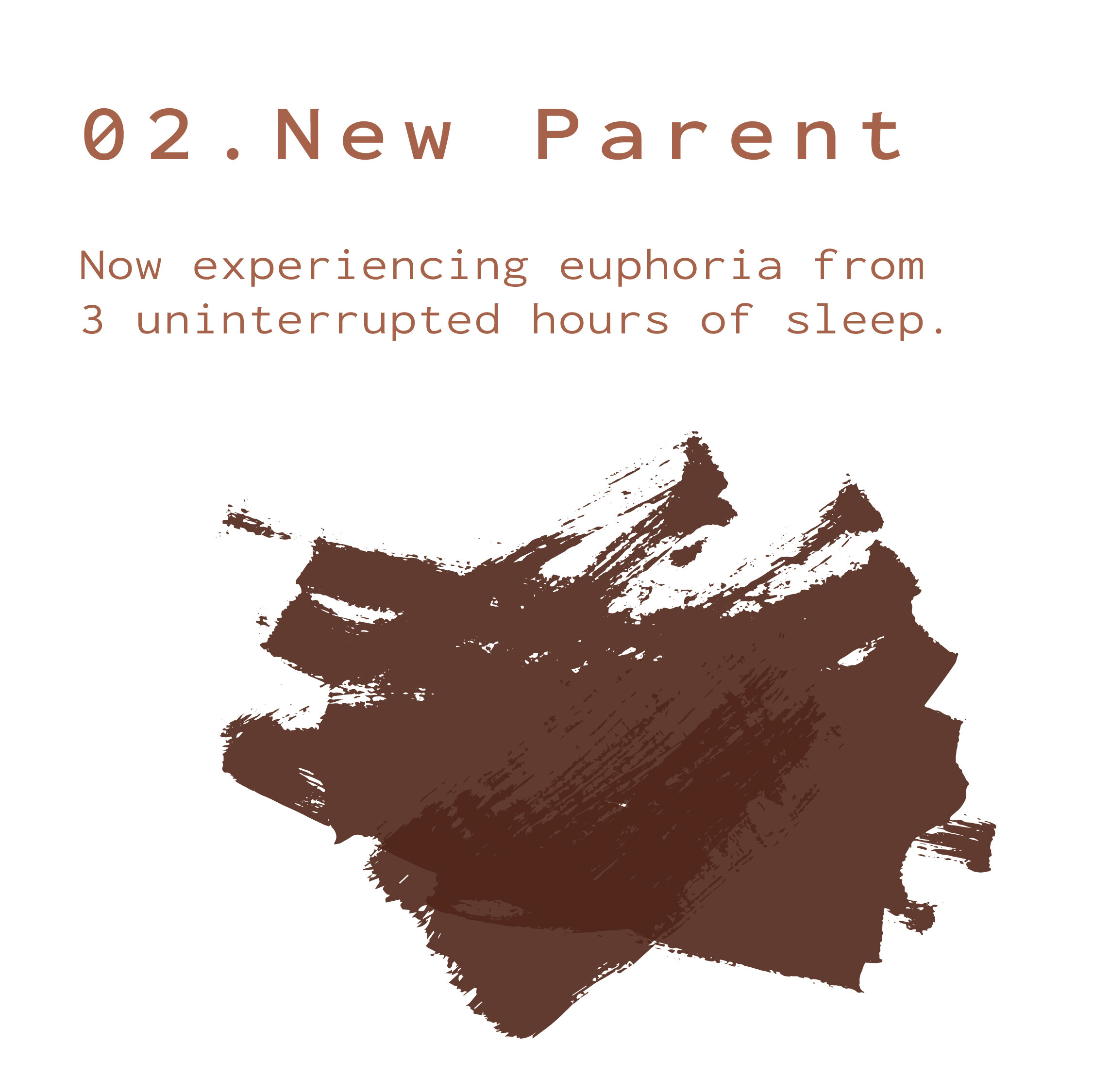
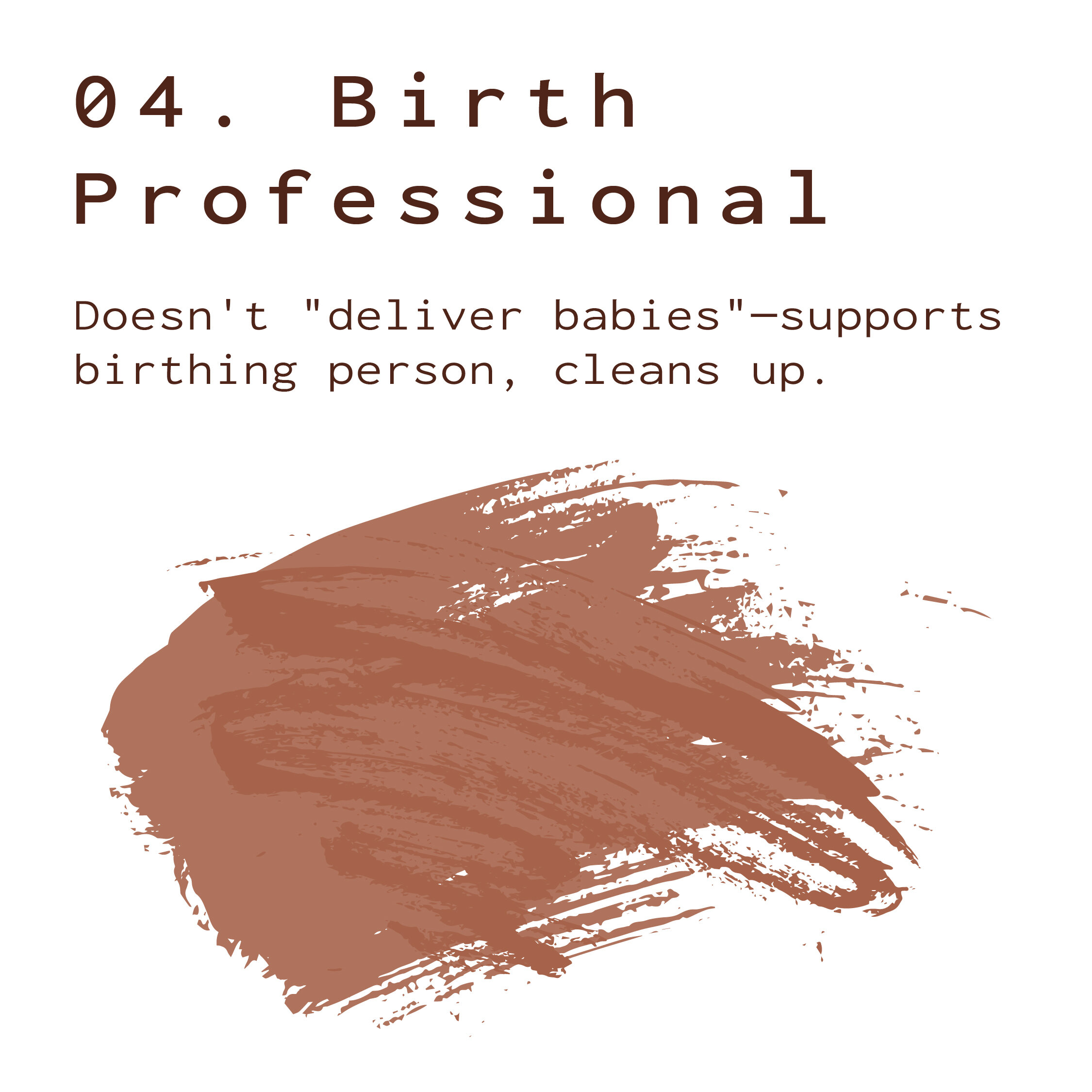
Our brand reflects that with plush curves, smears reminiscent of bodily fluids, imagery of diverse families and family setups, and new children. This is grounded with a supportive, yet humorous tone.


Clear Categorizations & Streamlined Navigation
Manhattan Birth’s previous web design tried to stuff all of their pages into one navigation bar. Ours simplifies this process for a user by directing them to their specific needs, with classes and resources categorized for pregnant folks, new parents, and birth workers.
Multi-Channel Automations
To cut down staff time and ensure a seamless and clear customer experience, we designed and set up integrations between Wordpress software, Learndash, ConvertKit, and Google docs. Customer interactions produced a variety of automated results, including database updates, email automations, and class enrollments, enabling the delivery of customized, relevant user content.
This website was strategized, created, and built alongside Amy Jacobus Marketing.


